Contributions by Lauren Haggerty and Jessica Grant
Integrating graphics within learning environments is not a modern concept. This incredible tool to brand spaces, connect with occupants, and to tell a story inside of a space has been around since humans began writing on walls. But history shows that blending art with architecture to enhance learning spaces has its roots as far back as the ancient Greek academy, as conceptually depicted in Raphael’s The School of Athens. Today, this medium is not a visual luxury relegated to just cultural elites as shown in that famous Renaissance fresco, but an inclusive cross-cultural form found in public and private institutions of all economic lines.
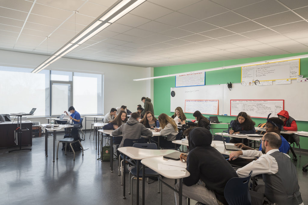
This medium, known as environmental graphics, enhances school spaces in many ways, such as setting the tone of a space, integrating the organization’s culture into the fabric of a building, influencing the mood of students and visitors, and forming more profound connections between the people and places. More and more schools are using graphics to increase school spirit, increase student engagement, reinforce school values, and offer surprising learning opportunities.
Telling a Story
Blackstone Valley Prep (BVP) is part of an increasing number of schools we encounter that express a keen interest in incorporating environmental graphics into their space. BVP staff understood that color and graphics can affect student mood, outlook, and attitude, all while establishing a creative and welcoming school environment.
The graphics are strategically placed throughout the school to inspire and encourage staff and scholars each day.
When developing concepts, we turned to BVP’s own culture and values for inspiration. BVP’s core set of principles—Perseverance, Respect, Integrity, Discipline, and Enthusiasm—became bold, typographic accent walls with the acronym P.R.I.D.E. Each letter uses a different typeface to celebrate BVP’s diverse student body and is paired with a quote chosen by members of the BVP community. Bright colors were selected to work with the school’s existing colors, blue and yellow, and provide contrast to the neutral palette of architectural finishes.
The graphics are strategically placed throughout the school to inspire and encourage staff and scholars each day. When entering BVP, you are greeted with the school’s mission statement and individual photos of each scholar. This acts as a daily reminder to scholars of the important role they play and the community of which they are a part. As one scholar commented, “Everything felt better, like it was a new beginning.”
Color Matters
Studies have shown by simply painting one wall in a classroom an accent color, students’ focus, attention, and ability to learn increase because it breaks up the space visually and gives students a place to rest their eyes. The color selected for these walls needs to be thoughtfully considered since color can influence students’ mood and how they feel in each space. Cool colors, like blue and green, have been shown to induce calmness and relaxation. These colors work well in libraries, study halls, the principal’s office, and other spaces where students may have high anxiety. On the other hand, warm colors have been shown to increase blood pressure and heart rate and stimulate brain activity and creativity. These colors work well in hallways and gymnasiums.
Students with special needs, such as autism, are particularly affected by color, making color selection even more critical. When designing for this population, bright, bold colors have been shown to be overstimulating, even debilitating, especially yellow and bright white. Soft “chalky” colors create spaces that are more comfortable, soothing, and safe for children on the autism spectrum.
Modest Investment with Maximum Impact
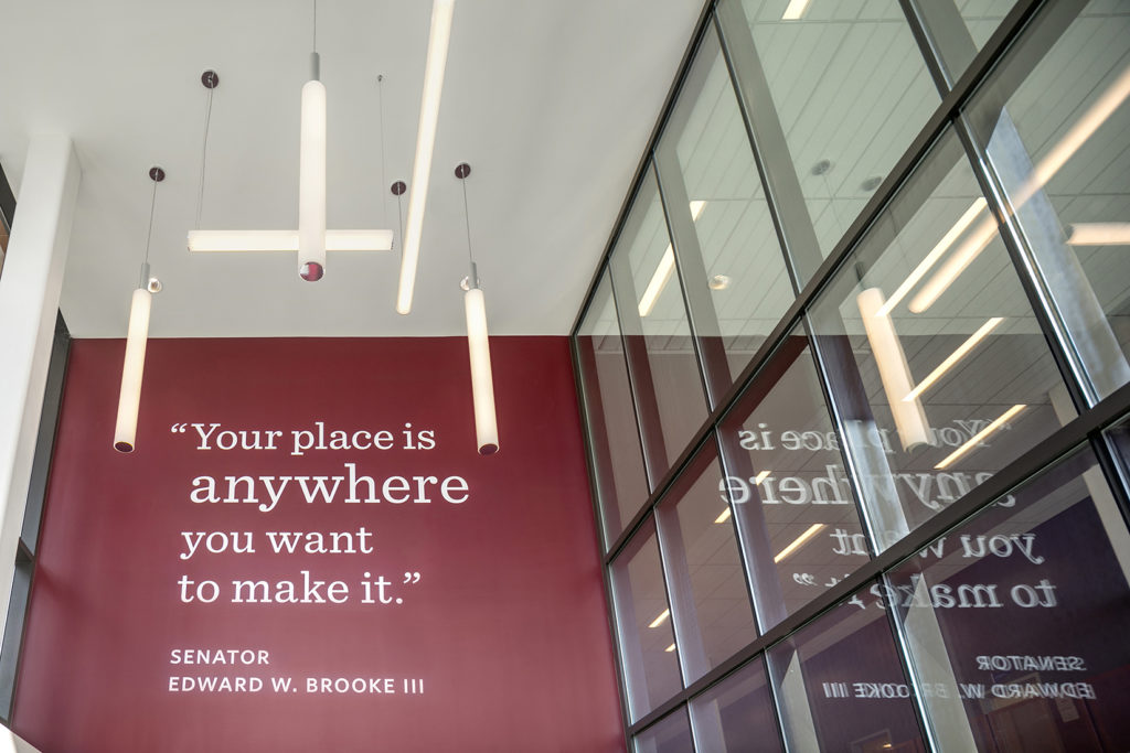
While schools are always mindful of budget, many are unaware of just how affordably environmental graphics can be incorporated into their space. In many primary school projects, the production and installation of the graphics have been as low 0.6%-0.8% of the overall construction budget. Funding limitations do not need to be a hinderance to thoughtful design. At Brooke Charter High School in Mattapan, MA, graphics with core value words and quotes make a big impact without breaking the bank. Core values are expressed as bold, typographic compositions and act as a reminder of what students should be readying themselves for, and that preparation goes beyond academics. “Your place is anywhere you want to make it”—a quote from the school’s namesake, the late senator Edward Brooke—greets students at the large double height entrance. The school originally wanted their athletic mascot in that space, but we felt strongly about using an inclusive message that all students—athletes and non-athletes alike—could relate to. The quote not only inspires positive thinking about the future, but it also acts as a daily reminder that they have the power to define it.
Early Engagement is Critical
Early client engagement is critical to educate and inspire an institution on the different ways environmental graphics can be used to tell their story and enhance their school. It is equally as important for architects, planners, and graphic designers to coordinate early and often to maximize the potential of the space. Architects can locate potential surfaces based on occupant or visitor sightlines, plan surfaces to be free of devices or excessive openings, or carefully plan adequate lighting to enhance future environmental graphic design installations.
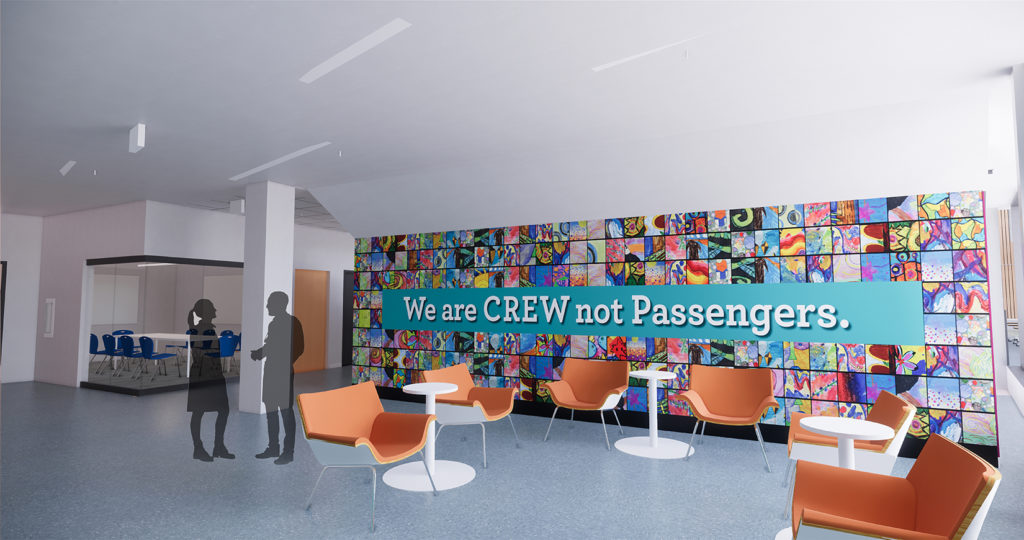
At Conservatory Lab Charter School in Boston, MA, we are utilizing a large space under a stair at the main entrance to highlight a key school mantra as well as a changeable showcase of artwork from each student to create a mosaic of color visible from the street. Using inexpensive materials, a wall that would normally be consigned to predictable paint, bulletin boards, or even storage is now a vibrant welcome to the school that mirrors its diverse population.
Thoughtfully integrating environmental graphics within learning environments improves the physical space and provides a positive visual and emotional influence on students, staff, and faculty. We will continue to explore new ways to communicate a school’s vision through this medium with inspiring results.